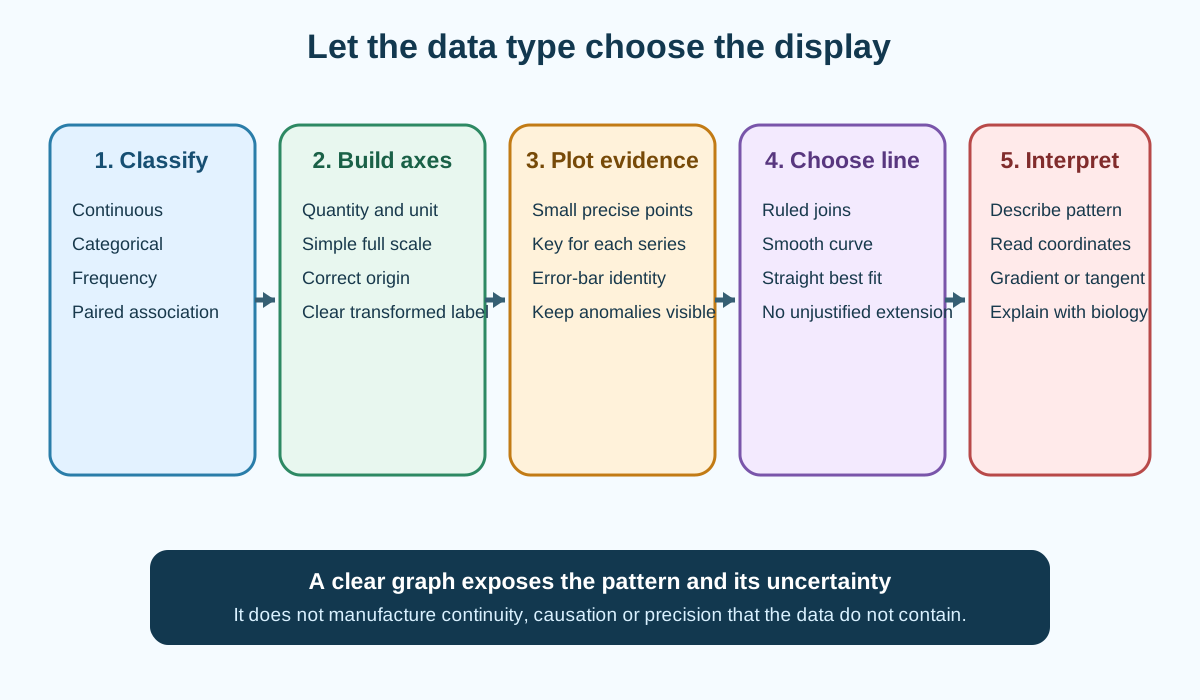
Tables, Graphs and Transformations develops the official Cambridge International AS and A Level Marine Science 9693 requirements for choosing and drawing line graphs, bar charts and histograms, then extracting coordinates, intercepts, gradients and biological meaning. A graph is an analytical model of the data, so every design decision must preserve variable type, measurement scale and uncertainty.
Official assessment boundary
Paper 2 and Paper 4 can require graph drawing and interpretation. The official AO3 criteria specify line graphs for continuous data, bar charts for discontinuous or categorical data and histograms for frequency data.
Axes must match table headings and units, use most or all of the grid, and be readable to half a square. Points must be plotted accurately with small crosses or dots in circles. Lines may be a best fit, smooth curve or ruled joins according to the data. Extrapolation is used only when the data justify it.
At A Level, graphs can include standard-error bars. Both levels can require calibration curves, gradients, tangents and transformation between numerical, graphical and algebraic forms.
Table structure before graphing
The table is the source for axis labels and plotted values. Keep the independent variable first, raw replicates visible and calculated means or rates in separate columns.
Use one unit per column and retain sufficient precision. A graph cannot repair rounded or mismatched source data.
Identify anomalous results before calculating a mean, but preserve the raw value and justify exclusion. If all replicates are plotted, do not conceal inconvenient points.
The recording note owns full table construction; this note uses the table to make a defensible visual model.
Choose the graph from data type
A line graph displays a continuous independent variable such as temperature, salinity, pH, time, depth or distance. Intermediate values are meaningful.
A bar chart compares separate categories such as habitat type, species or treatment identity. Bars are separated because the categories do not form a continuous numerical scale.
A histogram shows a frequency distribution for continuous measurements grouped into class intervals. Adjacent bars touch. When class widths differ, frequency density rather than raw frequency may be required so area represents frequency.
A scatter graph examines association between paired variables. It does not by itself establish causation.
Independent and dependent axes
Plot the independent variable on the horizontal x-axis and the dependent variable on the vertical y-axis unless a supplied convention requires otherwise.
Check this topic from memory
Attempt the matching topic bank before reopening the notes. Use each missed idea to decide what to review next.
Copy descriptive quantity names and units from the table. "Time / min" is useful; "x" or "results" is not.
For a transformed graph, label the transformed quantity explicitly, such as reciprocal time or logarithm of abundance. Do not label it as the original variable.
Category labels belong at bar centres, while histogram boundaries mark interval edges.
Choose a usable scale
Use most or all of the available grid while keeping values easy to plot and read to half a small square. Simple increments such as 1, 2, 5 or their powers of ten are usually effective.
Axes do not always need to begin at zero for line or scatter graphs, but a break or non-zero origin must not mislead. Bar-chart length encodes magnitude, so a zero baseline is normally important.
Mark scale values at regular intervals and check that every point fits before plotting.
Avoid awkward increments that turn every coordinate into mental arithmetic and increase plotting error.
Plot points accurately
Use a sharp pencil and small cross or small dot in a circle. The intersection or centre marks the coordinate.
Plot one series completely, then check values against the table before adding another. Use a clear key or direct labels when several series share axes.
Large blobs hide the actual coordinate and make half-square accuracy impossible.
Error bars should pass through the mean point and extend the correct amount above and below it according to the stated statistic.
Decide how points should be connected
Use ruled straight joins for a sequence where each point represents a defined successive state and interpolation between measured points is intended without assuming a smooth global model.
Use a smooth curve for a biological response expected to change continuously and nonlinearly, such as a rate approaching an optimum or plateau. The curve should follow the central pattern rather than pass through every point.
Use a straight line of best fit when the relationship is approximately linear. Balance points above and below across the range, not just around the centre.
Do not connect scatter points in observation order when the purpose is correlation.
Best fit and anomalies
A line of best fit represents the overall pattern and can reduce the influence of random scatter. It need not pass through the origin unless theory and data support that constraint.
An anomalous point lies away from the main pattern. Check plotting and transcription first, then method evidence. Do not redraw the line to force inclusion or erase the point.
State whether the anomaly is omitted from a calculation and why. A surprising point can indicate real biology, not merely error.
With very few or widely scattered points, a confident best-fit model may be unjustified.
Error bars
At A Level, error bars may show standard error and support judgement about certainty in mean estimates. Label or state what the bars represent.
Shorter bars indicate less uncertainty in the mean when scale and sample design are comparable. Overlap can inform whether a difference is likely to be statistically significant, but the syllabus expects a reasoned judgement using supplied context rather than an absolute visual law.
Standard deviation describes spread among observations; standard error describes precision of the mean estimate. Bars must not be interpreted as the full range unless they represent it.
Unequal sample sizes can affect standard error and comparison.
Describe a graph before explaining it
Identify direction, shape, key ranges, maximum or minimum, plateau, threshold and anomalies. Support the description with coordinates or calculated changes.
For example: oxygen production increased steeply from the first to third light value, then increased more slowly and approached a plateau.
Explanation adds mechanism, such as light ceasing to be the limiting factor. Keep description and explanation distinct.
Avoid writing only "positive correlation" when the graph shows a curve, optimum or changing gradient.
Interpolation and calibration curves
Interpolation estimates a value within the measured range. Draw from the known coordinate to the best-fit line or curve and then to the other axis, reading with the graph scale.
A calibration curve links known standards to measured response. An unknown response can be converted to concentration only within the validated range and under the same method conditions.
If the unknown lies beyond the standards, dilute it into range or prepare a wider calibration rather than extending the line casually.
Report the estimated precision supported by the graph, not extra calculator digits.
Extrapolation
Extrapolation predicts outside the measured range. It is less secure because the relationship may change, reach a limit or become biologically impossible.
The official criteria permit it only where the data allow. State the assumption that the observed relationship continues.
Avoid extending curves into negative abundance, impossible percentage cover or lethal conditions without evidence.
Whenever possible, collect additional values instead of relying on distant extrapolation.
Gradient of a straight line
Gradient is change in y divided by change in x:
gradient=ΔxΔy
Choose two well-separated points on the best-fit line, not necessarily raw data points. Draw a large gradient triangle and include units from y divided by x.
The sign shows direction. Magnitude shows rate of response per unit independent variable.
Do not invert the ratio merely because the x values are larger.
Tangent to a curve
A tangent touches a curve at the point of interest and matches its local direction. Draw the longest reasonable tangent that does not simply follow a wide section of curve.
Calculate its gradient using two well-separated points on the tangent. This estimates instantaneous rate of change at that coordinate.
A chord between neighbouring data points gives an average rate, not the tangent rate.
On a plateau, the tangent gradient approaches zero; at an optimum it can change sign.
Area under or between graphical regions
When a question defines biological meaning for area, estimate it with geometric shapes or a stated numerical method. Keep axis units, because area units are their product.
Do not assume every graph's area has scientific meaning. A concentration-time area and an abundance-distance area require context.
For irregular regions, smaller subdivisions improve approximation but should not create false precision.
Show the component calculations so the reasoning can be checked.
Transformations
A transformation changes variables to reveal a relationship, stabilise scale or support a supplied model. Examples include rate from reciprocal time, percentage change, logarithm, square root or normalisation per unit area or mass.
Transform every value consistently and show a sample calculation. Zero or negative values can make reciprocal or logarithmic transformations invalid.
A straight transformed plot does not erase biological assumptions. Interpret the transformed gradient and intercept in the context of the given relationship.
Do not transform only the points that fail to fit.
Reciprocal time as a rate proxy
In a clock investigation with a fixed endpoint, shorter time indicates faster process. Reciprocal time can be used as a rate proxy:
relative rate=time1
Its unit is reciprocal time. It is not an absolute production rate unless the fixed amount of change is known.
Transform individual times or justify the chosen order of averaging because reciprocal of the mean is not generally the mean of reciprocals.
Very small times amplify timing uncertainty.
Logarithmic and percentage displays
Log scales can display values spanning several orders of magnitude and can convert some multiplicative relationships into linear patterns. Axis labels must make the base and transformed quantity clear.
Percentage change compares change with the starting value. It becomes unstable when the initial value is zero or very small.
Normalising abundance per unit area or sampling effort enables fair comparison only if detection and method remain comparable.
A visual compression of differences on a log axis should not be described as a smaller absolute effect.
Multiple series and keys
Plot multiple treatments on the same axes when direct comparison is valuable and units and scales match. Use distinct permitted symbols or line styles and an unambiguous key.
Do not use colour as the only distinction in an examination drawing. Avoid clutter that hides individual points and error bars.
If scales differ fundamentally, separate panels may be clearer than a misleading second axis.
Compare series at the same x values and consider uncertainty before claiming one is greater.
Worked application: oxygen production against light
Mean oxygen-production rate is measured at six continuous light intensities with standard errors. Plot light intensity on the x-axis and mean rate on the y-axis, copying units from the table. Choose simple scales that use most of the grid, plot small crosses and add vertical standard-error bars. A smooth curve is appropriate if rate rises then plateaus; do not join scatter mechanically. Describe the steep rise and plateau with coordinates before explaining that another factor becomes limiting. Estimate the rate at an intermediate measured-range intensity by interpolation. To find local sensitivity, draw a tangent at the requested intensity and calculate change in rate divided by change in light using a large triangle. Extrapolation beyond the highest light value is weak because heating, photoinhibition or a new limit may alter the relationship.
Common misconceptions and corrections
Choosing every graph as a line graph. Data type determines display.
Using joined bars for categories. Bar-chart categories are separated.
Leaving gaps in a histogram. Continuous classes are adjacent.
Using frequency with unequal class widths automatically. Area may require frequency density.
Putting the dependent variable on the x-axis. The independent variable normally belongs there.
Labelling axes only x and y. Use quantity and unit.
Keeping an original label after transformation. Name the transformed variable.
Using only a small corner of the grid. Scale should use most of it.
Choosing awkward scale increments. They increase plotting error.
Starting a bar-chart axis above zero without warning. Bar lengths become misleading.
Plotting large blobs. The coordinate becomes unclear.
Omitting a key for multiple series. Data identity is lost.
Joining correlation points in order. Use a scatter pattern and best fit.
Forcing a best-fit line through every point. It represents the central trend.
Forcing the line through the origin. Theory and evidence must justify it.
Deleting an anomalous point from the graph. Preserve and evaluate it.
Calling every curved response a positive correlation only. Describe shape and range.
Explaining before describing. Establish the evidence first.
Calling standard-error bars the data range. They describe mean precision.
Treating any error-bar overlap as definitive. Use the stated interpretation and context.
Interpolating outside the data range. That is extrapolation.
Extending a calibration line far beyond standards. The response may change.
Reporting more precision than the graph supports. Read to the scale.
Using raw data points for a best-fit gradient. Use points on the line.
Using a tiny gradient triangle. Reading uncertainty becomes larger.
Calculating change in x divided by change in y. Gradient is change in y over change in x.
Giving gradient without units. Axis units determine them.
Using a chord as a tangent. It gives average rather than local rate.
Assuming every graph area has meaning. Context must define it.
Transforming selected inconvenient points only. Apply one rule to all values.
Taking a reciprocal of zero. It is undefined.
Calling reciprocal time an absolute rate automatically. It may be only a proxy.
Using logarithms without naming the base. The scale is ambiguous.
Claiming a log graph reduces the absolute difference. It changes display scale.
Using a second axis that hides incomparable units. Prefer clear separate panels.
Assessment guidance
Identify data type before choosing a line graph, bar chart or histogram. Copy quantity and unit labels from the table, select simple scales that fill the grid and plot precise small symbols. Choose ruled joins, a smooth curve or best fit from the scientific meaning of the points. Preserve anomalies and state what error bars represent. Describe direction, shape, range and key coordinates before explaining them. For interpolation, remain within the measured range; for extrapolation, state the continuation assumption. Use widely separated points on a best-fit line or tangent, show change in y over change in x and include units. Label every transformation and interpret it in the original biological context.
Retrieval practice
Classify ten marine datasets as line, bar, histogram or scatter displays and justify each. For one dataset, design axes and scales, plot two series with error bars and select the correct line treatment. Then read an interpolated value, evaluate an extrapolation, calculate a straight-line gradient and a tangent gradient, and transform a fixed-endpoint time series into reciprocal-time values with correct units and limitations.