

Cambridge IGCSE Statistics 2: Representation of data
Cambridge IGCSE Statistics 0479 notes on representation of data.
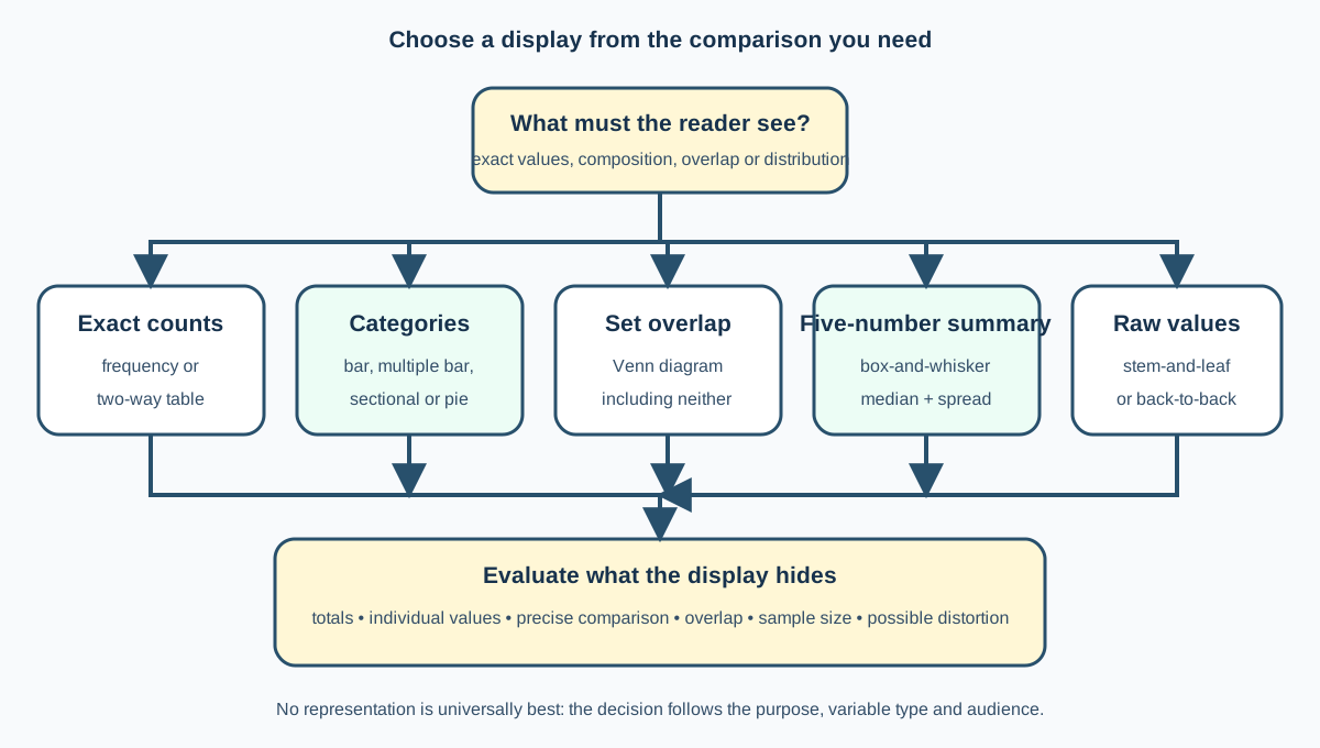
Cambridge IGCSE Statistics 0479 Topic 2 asks learners to represent and interpret frequency and two-way tables, pictograms, several bar-chart forms, pie charts, Venn diagrams, box-and-whisker diagrams and stem-and-leaf diagrams. It also requires choosing representations by purpose. Drawing pictograms and identifying box-plot outliers are explicitly outside the 2027 requirement.
1. Frequency tables
A frequency table records how often each category or value occurs. Categories must be mutually exclusive and collectively cover the data. Include a total to check that no observation has been lost or counted twice.
Relative frequency equals category frequency divided by total frequency. Percentage frequency is relative frequency multiplied by 100. Percentages support comparison between groups of unequal size, while raw frequencies retain the actual counts.
Ordering matters. Numerical values usually follow magnitude; ordinal categories follow their natural order; nominal categories can be ordered meaningfully or by frequency, but arbitrary reordering can hide comparison.
2. Two-way tables
A two-way table cross-classifies two categorical variables. Interior cells contain joint frequencies, while row and column totals are marginal frequencies. The grand total must equal both the sum of row totals and the sum of column totals.
Interpret the denominator carefully. “Of the bus users, what percentage arrived late?” uses the bus-user row or column total, not the grand total. “Of the late students, what percentage used the bus?” reverses the conditioning group.
An association is suggested when conditional proportions differ. A two-way table alone does not prove that one variable causes the other.
3. Pictograms
A pictogram uses repeated symbols with a key, such as one icon representing 20 people. Interpretation may require fractional symbols. Read the key before counting and distinguish a half-symbol from a half person when the key represents many units.
Pictograms are visually accessible for small simple data sets but become inefficient with many categories or awkward fractional values. Cambridge requires interpretation, not drawing.
4. Simple and multiple bar charts
A simple bar chart compares frequencies or values for separate categories. Bars have equal width and gaps because categories are discrete. The vertical axis starts at zero unless a clearly signalled break has a defensible purpose; truncated axes can exaggerate differences.
A multiple bar chart places bars for two or more groups side by side within each category. Use a consistent legend and bar order. It supports direct group comparison but becomes cluttered with many series.
Check this topic from memory
Attempt the matching topic bank before reopening the notes. Use each missed idea to decide what to review next.
Start the topic quiz