

Pearson International GCSE Mathematics A 4: Statistics

Study guide

Pearson Edexcel International GCSE Mathematics A notes on data, probability, sampling and statistical diagrams.

Statistics turns collected data into summaries, comparisons and probability-based decisions.

Pearson 4MA1 Statistics requires attention to how data were obtained as well as how they are processed. A precise average from a biased sample is not representative, and a polished diagram can mislead if it uses the wrong scale, density or event model.
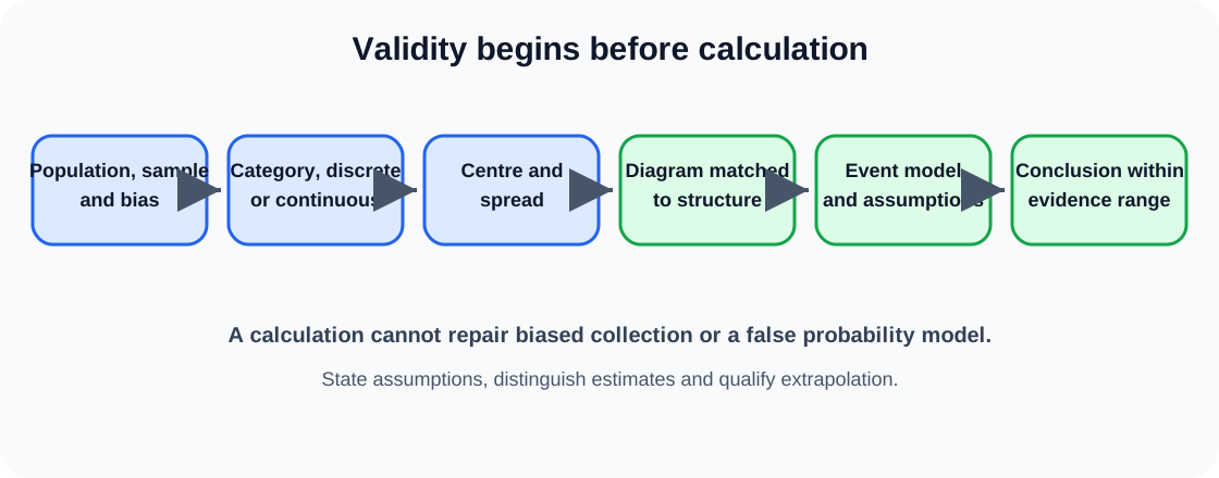
A statistics workflow from population and sampling through data type, summary, diagram, probability model and qualified conclusion.

Main ideas

  • Distinguish populations, samples, discrete data and continuous data.
  • Calculate and interpret averages and measures of spread.
  • Construct and interpret frequency tables, histograms, cumulative-frequency diagrams, box plots and scatter graphs.
  • Estimate statistics from grouped data and explain limitations of estimates.
  • Use probability scales, sample spaces, tree diagrams and set notation.
  • Apply addition and multiplication rules with attention to exclusivity and independence.

Population, sample and data type

The population is the complete group of interest; a sample is the subset observed. A census studies every member but can be expensive or impractical. A sample can estimate population behaviour only when selection and non-response do not create serious bias.

Simple random sampling gives each member an equal selection opportunity. Systematic sampling uses every kth member after a suitable start. Stratified sampling represents defined subgroups in population proportions. Convenience and voluntary-response samples are easy to collect but often biased.

Categorical data describe groups. Numerical data may be discrete counts or continuous measurements. Data type determines valid summaries and diagrams. A category code such as 1 for red and 2 for blue does not make colour numerical.

Averages and spread

The mean uses every value and is sensitive to extremes. The median is the middle after ordering and resists outliers. The mode is the most frequent value or category. Choose an average by context rather than assuming the mean is always best.

Range is maximum minus minimum. Interquartile range measures the spread of the middle half and pairs naturally with the median. Two data sets with the same mean can have very different spread, so comparisons should discuss both centre and variability.

For a frequency table, multiply each value by frequency before summing and divide by total frequency. For grouped continuous data, use class midpoints, making the result an estimate because exact values within each class are unknown.

Frequency diagrams and histograms

A bar chart displays categories with separated bars. A histogram displays grouped continuous data with touching bars. When class widths differ, vertical height is frequency density, calculated as frequency divided by class width; bar area then represents frequency.

A frequency polygon plots class midpoint against frequency or the relevant density and joins points. State which quantity the vertical axis represents. Never read histogram height as frequency unless class widths and scale make that valid.

Pie-chart angles represent category proportion of 360 degrees. The diagram is useful for composition but weak for precise comparisons among similar sectors.

Cumulative frequency and box plots

Cumulative frequency totals observations up to each upper class boundary. Plot upper boundaries and join with a smooth increasing curve. Read median and quartiles at one half and one quarter or three quarters of total frequency, then project to the data axis.

A box plot shows minimum, lower quartile, median, upper quartile and maximum under the stated convention. Compare medians for typical value and interquartile ranges for middle-half spread. Whisker overlap does not by itself prove the distributions are the same or different.

Scatter graphs and correlation

A scatter graph displays paired numerical values. Positive correlation means larger values tend to accompany larger values; negative correlation means the opposite. Strength describes how closely points follow a pattern. An outlier should be investigated, not deleted automatically.

A line of best fit can estimate one variable from the other within the observed range. Interpolation is safer than extrapolation because the relationship may change outside the data. Correlation does not prove causation: a third variable, reverse direction or coincidence may explain the association.

Probability foundations

Probability lies from zero to one. For equally likely outcomes, favourable outcomes divided by total outcomes gives probability. Experimental relative frequency estimates probability and usually stabilises with many trials, but it need not equal the theoretical value exactly.

List outcomes systematically with tables, tree diagrams or sample spaces. Complementary events sum to one. Mutually exclusive events cannot occur together, so their intersection is empty. Independent events can occur together, but one does not change the probability of the other.

Addition, multiplication and conditional structure

For event A or B, add their probabilities and subtract overlap. If events are mutually exclusive, overlap is zero. For A and B along a tree path, multiply conditional branch probabilities. Add probabilities of distinct paths that satisfy the target event.

Sampling without replacement changes later probabilities, so tree denominators and numerators must be updated. With replacement, the original composition is restored. Conditional probability restricts the sample space to cases where the given event has occurred.

Venn diagrams show unions, intersections and complements. Fill the intersection first when totals overlap, then exclusive regions, then the outside. A verbal or is usually inclusive unless the context explicitly excludes simultaneous occurrence.

Estimated frequencies and expected outcomes

Expected frequency is probability multiplied by number of trials. It is a long-run expectation, not a guarantee for one experiment. Conversely, relative frequency from data can estimate probability and predict an approximate count in a larger similar trial set.

Check that category probabilities sum to one and expected counts sum to the total. A model may fail if outcomes are not equally likely or trials are not independent.

Worked example

A school has 600 students: 180 in Year 9, 210 in Year 10 and 210 in Year 11. A stratified sample of 80 should include 80 multiplied by each year group's population fraction. This gives 24 Year 9 students, 28 Year 10 students and 28 Year 11 students. Random selection within each year is still needed; choosing one convenient class from each year would preserve the numerical proportions but could remain biased by class grouping. If two selected students do not respond, replacing them from the same stratum using the original random method protects the planned composition better than asking nearby volunteers. Stratification represents the chosen year-group variable, but it does not automatically represent every other characteristic such as subject choice or attendance.

Common mistakes

  • Using frequency as histogram bar height when class widths differ.
  • Assuming correlation proves causation.
  • Adding probabilities for events that can occur together without subtracting their overlap.
  • Treating category labels encoded as numbers as quantitative data.
  • Reporting a grouped-data mean as exact rather than estimated.
  • Comparing box plots using only medians and ignoring spread.
  • Keeping tree probabilities unchanged after sampling without replacement.
  • Calling mutually exclusive events independent.

Assessment guidance

Start by identifying population, sampling method and data type. State likely bias before calculating summaries. For grouped data, show midpoint products and label the mean as an estimate. Match diagram to structure: separated bars for categories, frequency density for unequal histogram classes, upper boundaries for cumulative frequency and paired points for scatter. Compare distributions using both centre and spread. In probability, define whether events are mutually exclusive, independent or conditional before choosing addition or multiplication. Update branches without replacement and account for overlap in inclusive or questions. Keep conclusions within the sample, model assumptions and observed range.

Check yourself

Explain why a stratified sample may represent a school population better than a convenience sample of one class.

Then retrieve: Which population proportions must be preserved? How are students chosen within each stratum? Which biases can remain even after proportional allocation? How should non-response be handled without replacing random selection with convenience?

Official specification boundary

This note follows the statistics and probability content of Pearson Edexcel International GCSE Mathematics A 4MA1. It includes cross-tier and Higher Tier representations and event reasoning; candidates should follow the tier applying to their paper route.

Return to the Mathematics A hub.

Check this topic from memory

Attempt the matching topic bank before reopening the notes. Use each missed idea to decide what to review next.

Start the topic quiz

Sources

  1. Pearson International GCSE Mathematics A 4MA1 specification